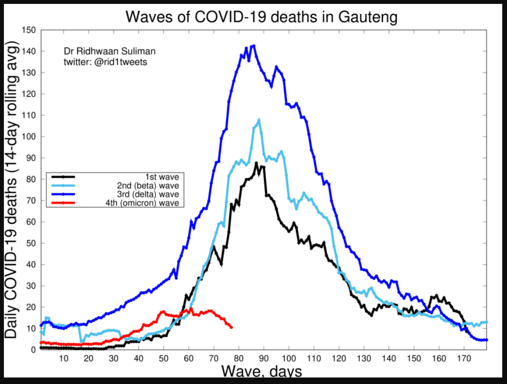
Best to remember that these kinds of graphs are always based on dubious statistics because the CDC had grossly fudged both covid PCR test and cause of death numbers. Some estimates are as low as only 6% actually “died from” covid. If this 6% figure is even remotely true, the waves in the graph above would better be read as “propaganda waves” or “fear porn waves” as our health officials turned up the heat to drive a highly stressed population toward mass vaxxination. ABN
