
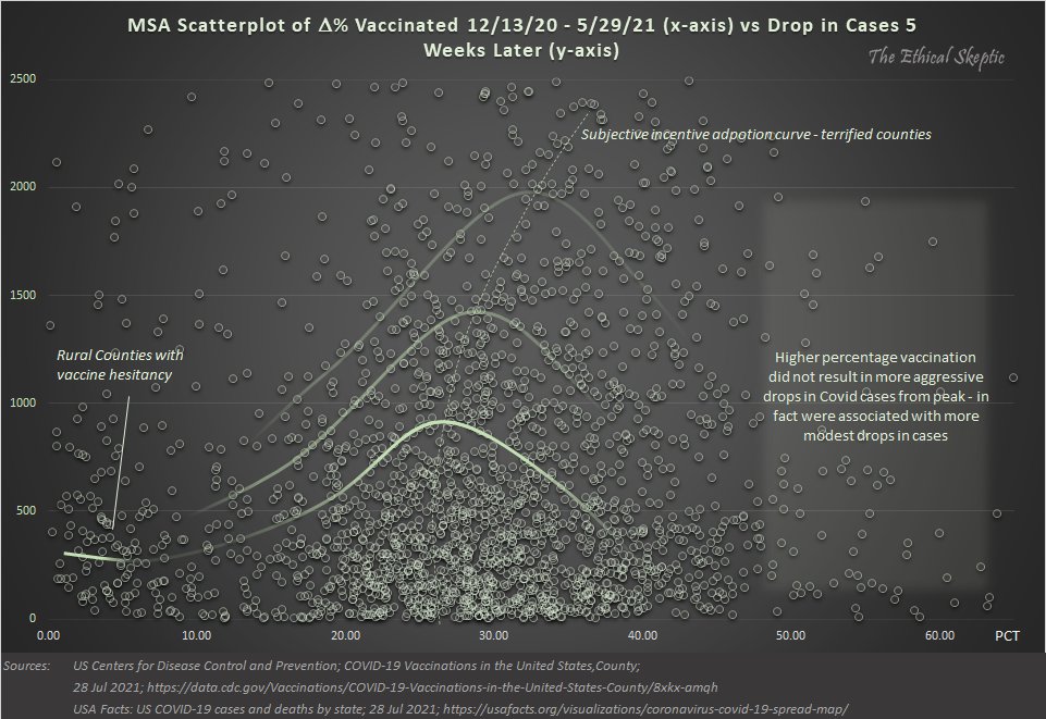
What inference does one draw from this ‘actual results’ comparative by US county chart? Yes this is hard, but this issue is paramount – not suitable as a political football.
I know exactly what I see.
– the refuseniks tail
– the terrified tail
– the diminishing return nose
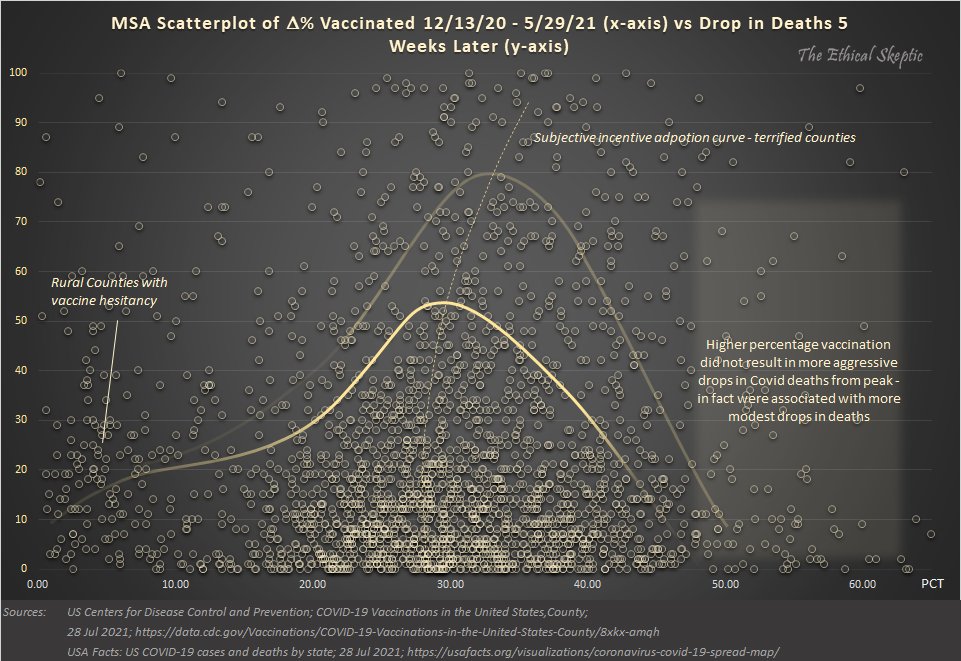
Here is the same approach, arrival distribution gradient chart, for deaths.
– the same complexion as cases
– curve normalizes as drops in death increase
– low vax counties reduced deaths the same as high vax counties
No relationship between vaccine acceptance & performance.
Originally tweeted by Ethical Skeptic ☀ (@EthicalSkeptic) on August 8, 2021.
