

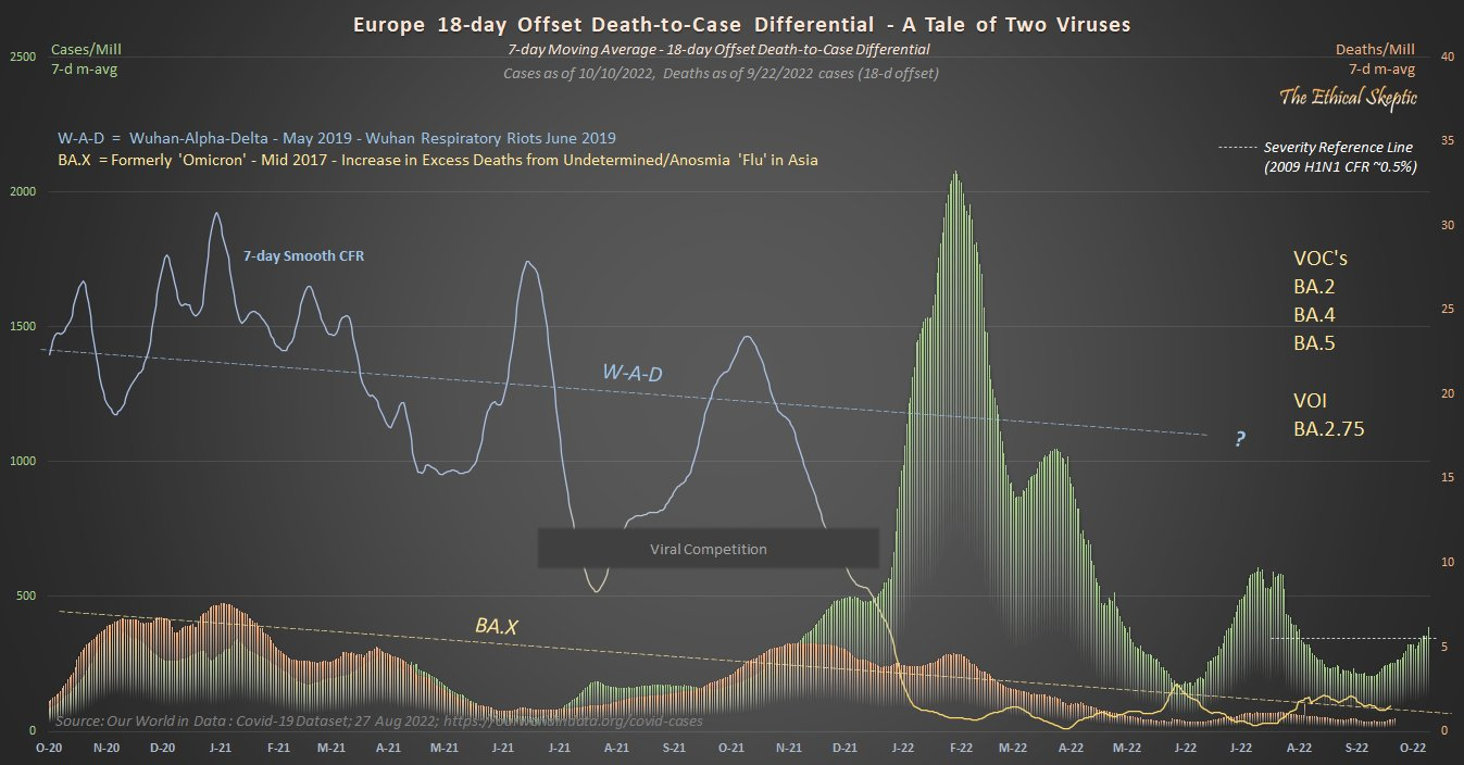
I am highlighting this graph because it is both readily accessible and highly informative. It requires some effort to understand this graph, but not that much and the data could not be displayed more clearly any other way. This image beautifully diagrams a moving event–covid infections and deaths–allowing us to grasp it as a complex whole over time. Once you understand this graph, the rest of TES’s work will be much easier to understand. I highly recommend spending the time to understand this and then following his work on Twitter and his blog. He has been doing work our health officials and academics should have been doing but were either incapable, afraid, or worst of all had bad motives which some of them surely did. ABN
